Research / Product strategy / UX/UI Design / AI-assisted process
FitMatch, a personal size assistant that learns from your purchase history to recommend the right size for any brand you shop online
Project
FitMatch
Role
Product Designer
Project type
Personal project
Year
2026
My role
I led this end-to-end project as a solo designer, from problem framing and research through to information architecture, wireframing, and UI design. I used AI tools across every phase to enhance the process.
1. Overview
Context
Online fashion has a sizing problem no one has fully solved. Customers return items, abandon carts, and stick to brands they already know, because they can't trust that something new will fit.
FitMatch is a mobile app that learns from the user purchase history and fit feedback to recommend the right size for any brand, before purchasing. The size profile belongs to the user, not to the store.
AI-assisted design process
AI was integrated throughout the project as a working tool, not a shortcut. Claude supported strategic thinking, research structuring and design decisions. UX Pilot and Figma Make were explored during wireframing to accelerate iteration, and outputs were evaluated and refined with Figma based on UX criteria.
2. The problem
What the data tells us
· 88% of online shoppers have returned an item due to incorrect sizing.
· 73% have abandoned a purchase because they weren't confident about the size.
· 73% limit themselves to brands they already know to avoid sizing mistakes.
· 68% have no system to keep track of their sizes across brands.
Sources: PowerReviews 2024, Sendcloud 2024, Statista, iF Lastmile 2023.
The core problem
Online shoppers have no reliable way to know what size to order from a brand they don't know. The tools available today are built into the retailer's platform: generic, disconnected, and doesn't account for their personal purchase history or the real behaviour of each garment. The result: avoidable returns, abandoned carts, and an involuntary dependence on familiar brands.
Design question
How might we help online shoppers always order the right size, regardless of the brand?
3. Research
Synthetic approach
With no resources for primary research, I combined secondary sources with a synthetic research method: a survey designed from real market data and answered by AI-generated user profiles based on validated behavioural patterns. This allowed me to simulate research findings grounded in real evidence rather than assumptions.
Every existing solution is built for retailers, not for shoppers
I started by mapping the competitive landscape to understand what solutions already exist and where the real gaps are.
A key finding
True Fit, Zalando Size Advisor, MySizeID: all of them live inside the store. None of them give the user a portable, personal size profile they can take anywhere. That market gap became the foundation of FitMatch.
Two shoppers, same problem, different breaking point
Based on research synthesis, I defined two personas representing opposite ends of the same problem:
Laura, 29: Reactive shopper. Buys frequently, returns often.
Marcos, 38: Cautious shopper. Abandons the cart if he's not confident about the size.
The moment FitMatch had to own
Mapping both journeys side by side revealed the critical moment FitMatch needed to address: the size selection step, where Laura guesses and Marcos gives up.
What the research actually revealed
After synthesizing research data and user stories, we identified four key insights.
1. The problem is not returns, it's uncertainty.
The root cause is that shoppers have no reliable information at the moment of decision.
2. Existing tools don't travel with the user.
Every solution resets when you change retailer.
3. Qualitative fit data is missing everywhere.
Knowing someone ordered an M is ok, but knowing it shrank after washing is what actually helps.
4. The cold start problem is real but solvable
A new user with no history can still get value from community data from day one.
4. Product strategy
The value proposition
FitMatch is a personal size assistant that learns from the purchase history and the collective knowledge of online communities to recommend the right size in any brand, before the user buys. Not inside a retailer but wherever the shopper buys.
A recommendation built on three layers of data
FitMatch's recommendation engine combines three data sources, each solving a different part of the problem.
1. Personal history
Sizes and fit feedback from the user's own purchases, imported from email or added manually. Specific to that person's body and preferences.
2. Open communities
Public data from Reddit, forums, blogs and reviews, processed to extract sizing insights for specific brands and garments.
3. FitMatch community
Aggregated fit data from other FitMatch users with similar profiles. Gets stronger as the user base grows. Planned for V2.
What sets FitMatch apart from the rest of the market?
1. The size profile is portable, across every brand and retailer.
2. Combines personal and community data, more reliable than one source.
3. Qualitative fit feedback is a first-class input.
Deciding what MVP needed to be
I used a MoSCoW prioritisation to decide what was essential from what could wait.
Flow 1
Onboarding
with email purchase import
Flow 2
Size recommendation
triggered from any ecommerce
5. Information architecture & user flows
Three entry points, one coherent system
FitMatch is built around three tabs that reflect the three simple things a shopper needs:
Get a recommendation, manage their history and manage their profile.
Two flows that cover the full user cycle
Flow 1: Onboarding + Email purchase import
The user connects their email, the app imports their purchase history automatically, and they optionally add qualitative feedback for each item. Every decision was made to reduce friction while maximising the data quality that powers future recommendations.
Flow 2: Size recommendation from ecommerce.
The user shares a product page directly from their browser. FitMatch identifies the brand and returns a recommendation combining personal history and community data. Two sources, always visible
A design decision that improved the onboarding
The original onboarding ended at import confirmation, was useful but passive. Adding a qualitative review step changed that: after confirming their purchases, users rate the fit of each item. The more they share upfront, the better FitMatch works from day one.
6. Wireframes
AI as a wireframing accelerator
This phase was the first where AI tools moved from strategic support to direct design output. I used UX Pilot and Figma Make to generate initial screen structures from detailed prompts, then evaluated and refined each output based on UX criteria.
Structure before style
The wireframing process began with Flow 01, the most complex and critical flow of the product.
7. Design
An identity built around confidence
FitMatch's visual language has one job: make the user feel certain. Every decision (color, type, spacing) was made to reduce hesitation and communicate precision.
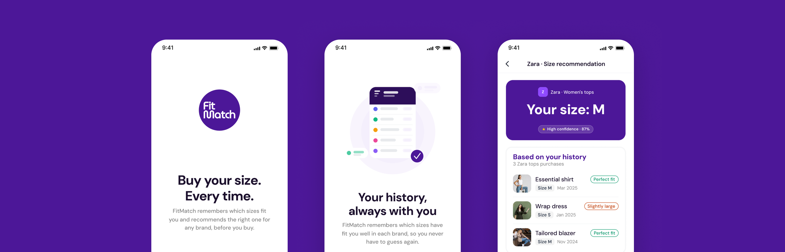
The primary color is a saturated violet. In a market dominated by neutral, retailer-safe palettes, violet signals that FitMatch belongs to the user. It's the color of the recommendation, the moment of confidence.
The component system is built around one core moment: the size recommendation. The recommendation card carries the size, the brand and the confidence level in a single glance. Everything else exists to support that moment.
8. Prototyping
Two flows that cover the full user cycle
Together, these two prototypes complete a full cycle: a new user creates their profile, receives a recommendation while browsing, and manually adds a size when necessary.
Prototype 1:
Onboarding with email purchase import
The user registers, connects their email, FitMatch imports their purchase history automatically, and reviews and confirms detected purchases.
The qualitative review turns onboarding into the first step toward building a personalized engine.
Prototype 2:
Size recommendation from ecommerce
The user shares a product from an ecommerce. FitMatch identifies the brand and returns the size recommendation combining personal history and community data, both sources always visible.The confidence level is always visible to the user.
9. Key decisions
1. The step that makes the recommendation feel yours
Adding the qualitative review step changed what the onboarding produces. The user tells FitMatch how each item actually felt, and that fit feedback is the most valuable input in the system. When FitMatch recommends a size, it feels like a conclusion based on their own words.
2.Two sources are always better than one hidden algorithm
Early versions showed a single result with a confidence level. The reasoning was invisible: the user had to trust the output without understanding the input. Showing personal history and community data as two separate, named sources turned the recommendation from a black box into a transparent argument. When both sources agree, the user buys with confidence. When they differ, they have the context to decide for themselves.
10. Learnings
What I would do differently
Working with synthetic research means one scenario was never truly stress-tested: a first-time user with no purchase history at all. The medium confidence state in Flow 02 handles it functionally, but real user behavior in that moment (the hesitation, the distrust) is something only live testing would reveal. It's the part of the experience I'd validate first.
On AI tooling: the quality of the output depends entirely on the quality of the input. A vague prompt produces a generic screen. A precise prompt, grounded in real product decisions, produces something worth refining.
My design tools
Notion
Figma
Mobbin
NotebookLM
Forms
ChatGPT

Condens